
Why Everything Online Is Starting to Look the Same
The internet has never looked more polished, yet websites, brands, AI images, and digital products increasingly feel strangely familiar. Vixel explores how templates, algorithms, design systems, and generative AI are accelerating visual sameness—and why taste, restraint, and distinctive creative direction may become more valuable than perfect execution.
 Vortixel
11 minutes read
Vortixel
11 minutes read
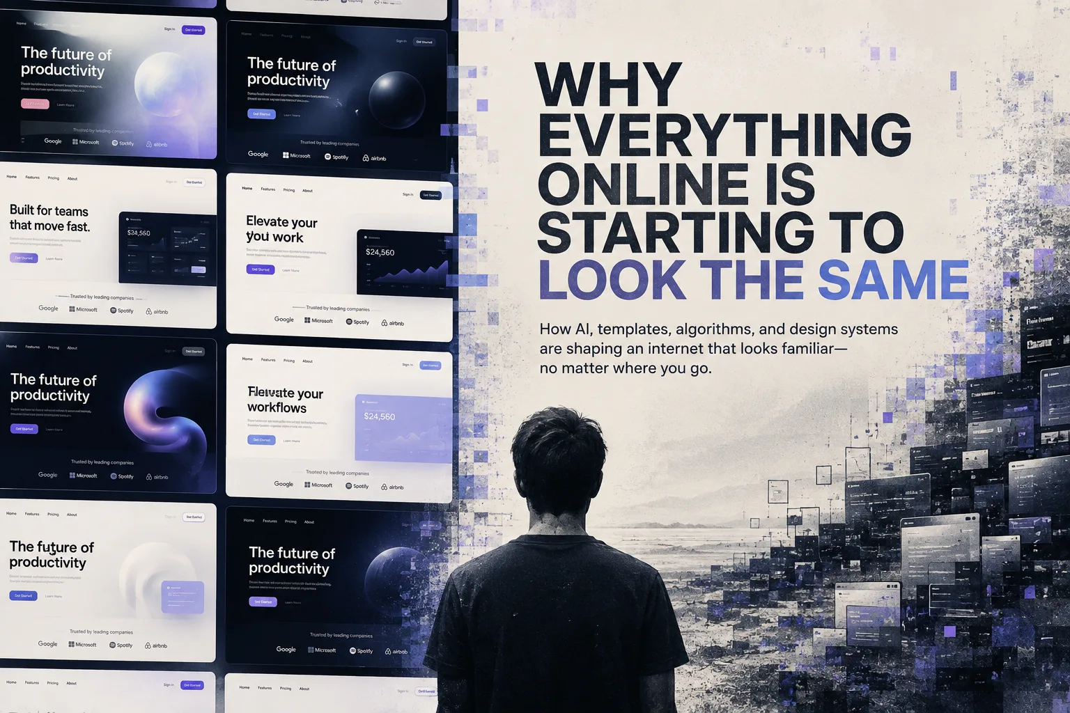
Open five startup websites in separate tabs and give yourself ten seconds with each one.
There is a decent chance you already know what is coming.
A dark background. A glowing object floating somewhere near the center. Huge sans-serif type. A headline promising to “reimagine” something. Soft gradients crawling behind translucent cards. Maybe a grain texture, perhaps a chrome sphere, and definitely enough rounded corners to make the entire interface feel vaguely inflatable.
None of these decisions are necessarily bad.
That is exactly what makes the current era of visual sameness so interesting.
The problem is not that contemporary design has become ugly. In many ways, the average digital product has never looked more polished. Tools are better. Templates are smarter. Typography is easier to access. Production is faster. Designers can prototype complicated interfaces in hours instead of days, while generative systems can produce entire visual directions before someone finishes their first coffee.
And yet the internet increasingly produces a strange sensation: you have seen all of this before.
Not the exact website.
Not the exact illustration.
Just the visual idea behind it.
That distinction matters.
Because what we are watching is not simply another aesthetic trend. It is a shift in how visual culture gets produced.
The Internet Has Always Copied Itself
Design has never developed through pure originality.
Swiss typography influenced corporate design. Punk borrowed from photocopiers and underground publishing. Early web designers borrowed metaphors from physical desktops. Apple’s interfaces influenced an entire generation of digital products. Instagram changed photography. Pinterest created its own visual vocabulary. TikTok changed editing rhythms.
Creative work has always involved imitation, reinterpretation, reaction, and eventually rejection.
That cycle is healthy.
Someone introduces an idea. Other people copy it. The idea becomes familiar. Designers push against it. Something new appears.
The difference today is speed.
A visual language that once might have taken several years to become mainstream can now spread across thousands of projects in months.
A striking landing page appears.
It reaches design Twitter, LinkedIn, Behance, Dribbble, Pinterest, Instagram, and inspiration newsletters.
Screenshots become references.
References become Figma files.
Figma files become templates.
Templates become tutorials.
Tutorials become AI prompts.
Soon the original idea is no longer an idea.
It is infrastructure.
Templates Quietly Became the Architecture of the Web
Templates democratized good design.
That should not be dismissed.
A small business owner does not need to understand typography systems to create a respectable website anymore. A creator can build a portfolio without hiring an agency. A two-person startup can launch something that looks surprisingly mature.
This is a genuine improvement.
But templates also introduce defaults.
And defaults are powerful.
If a website builder recommends certain layouts, thousands of users begin from approximately the same visual structure.
Hero.
Social proof.
Three feature cards.
Product screenshot.
Testimonial.
Pricing.
FAQ.
Call to action.
The content changes while the skeleton survives.
Eventually even custom-designed websites begin behaving like templates because designers and clients have internalized the same conventions.
This is where sameness becomes difficult to diagnose.
Nobody necessarily copied anyone.
Everyone simply made the “correct” contemporary choices.
The result is convergence without conspiracy.
AI Did Not Invent Visual Sameness
Generative AI is often blamed for making everything look the same, but that explanation is almost too convenient.
The convergence started earlier.
Branding had already moved toward simplified identities. Digital products had already normalized large type, spacious layouts, rounded cards, neutral color systems, and reusable components. Design systems encouraged consistency because consistency makes products easier to build and maintain.
Then generative AI arrived and dramatically increased the velocity of the existing system.
That distinction is important.
AI did not create our visual habits from nothing.
It learned them.
Generative systems are remarkably good at producing something that looks like the statistical center of what humans already consider visually convincing.
Ask for a premium technology campaign and certain lighting patterns appear.
Ask for a futuristic interface and the familiar glowing gradients emerge.
Ask for a luxury product shot and you can almost predict the marble, reflections, soft shadows, and impossible studio lighting.
The images may be technically unique.
The visual logic often is not.
This is one of the strangest contradictions of generative media.
We now have tools capable of producing almost infinite images, yet infinity does not automatically create diversity.
Sometimes it creates infinite variations of the same taste.
When Good Design Becomes a Preset
There is an uncomfortable question designers rarely enjoy asking:
What happens when “good taste” becomes predictable?
For years, learning design partly meant learning what not to do.
Avoid awkward spacing.
Limit unnecessary fonts.
Build hierarchy.
Respect contrast.
Use grids.
Maintain consistency.
Reduce clutter.
These principles remain useful.
But once millions of people gain access to tools that automatically apply competent spacing, typography, hierarchy, and color relationships, technical cleanliness stops being rare.
The baseline rises.
A polished interface is no longer impressive merely because it is polished.
This changes the value of creative skill.
Execution still matters, but execution alone becomes less differentiating.
Taste matters more.
Judgment matters more.
Knowing when to break the system matters more.
The designer’s role gradually shifts from someone capable of producing something attractive toward someone capable of deciding what should exist at all.
That is a much harder problem.
The Algorithm Likes Things It Already Understands
Visual sameness is not created only by design tools.
Distribution systems also participate.
Algorithms operate more comfortably around recognizable patterns.
Creators notice what performs.
Certain thumbnail compositions attract clicks.
Certain editing rhythms retain viewers.
Certain color combinations communicate familiar genres.
Certain layouts feel immediately legible.
Then creators repeat them.
Not because they lack imagination, but because experimentation carries risk.
A YouTube thumbnail has milliseconds to explain itself.
An ecommerce image needs to communicate instantly.
A social post competes with hundreds of others.
A landing page needs visitors to understand the product before they leave.
Under these conditions, familiarity becomes efficient.
And efficiency gradually becomes an aesthetic.
This explains why visual culture can feel both chaotic and strangely uniform at the same time.
There are millions of images.
Millions of creators.
Millions of brands.
But much of that enormous output still travels through a relatively small number of recognizable visual formulas.
We Are Designing for Recognition Before Memory
Modern digital design has become extremely good at immediate recognition.
You can usually tell when something is a fintech product.
A crypto platform.
A wellness brand.
An AI startup.
A direct-to-consumer skincare company.
A productivity app.
The visual categories are already established.
That helps users understand context quickly.
But there is another question:
Can you remember which company it was five minutes later?
Recognition and memory are not the same thing.
A design can communicate its category perfectly while communicating almost nothing unique about itself.
That may be the defining branding problem of the current era.
Visual execution is abundant.
Distinctive meaning is scarce.
When every company possesses competent typography, professional imagery, slick motion, and immaculate art direction, those things stop functioning as advantages by themselves.
The interesting brands are increasingly the ones willing to look slightly wrong.
Not badly designed.
Just unmistakably themselves.
Imperfection Is Becoming Valuable Again
This helps explain the return of rougher aesthetics.
Visible texture.
Handmade lettering.
Unpolished photography.
Collage.
Brutalist layouts.
Strange typography.
Analog artifacts.
Uneven compositions.
These choices would have looked unfinished during an earlier period obsessed with seamless digital perfection.
Now they can feel refreshing precisely because perfection has become inexpensive.
When software can instantly create smooth gradients, flawless product renders, and technically beautiful imagery, evidence of friction becomes meaningful.
A crooked line suddenly communicates something.
A real photograph with imperfect lighting communicates something.
A typeface with personality communicates something.
Even mistakes can become signals of authorship.
This does not mean every brand should start scanning torn paper and pretending it was made in a basement.
Artificial imperfection can become another template surprisingly quickly.
The point is not that messy equals authentic.
The point is that audiences are becoming more sensitive to whether a visual system feels chosen rather than merely generated from contemporary defaults.
The Strange Rise of the “AI Look”
One of the funniest developments in generative imagery is that AI has developed recognizable visual habits despite its ability to imitate countless styles.
You know the feeling.
Hyper-detailed skin.
Dramatic rim lighting.
Perfectly arranged compositions.
Surfaces that seem slightly too smooth.
Cinematic atmosphere without a clear reason for being cinematic.
Tiny details everywhere and personality nowhere.
The technology continually improves, so many obvious artifacts disappear.
But removing technical mistakes does not automatically remove aesthetic predictability.
In fact, increasingly perfect AI images may make the deeper issue easier to notice.
The problem was never just extra fingers.
It was visual intention.
Why is this angle being used?
Why this lighting?
Why does this composition exist?
What is the image trying to communicate beyond “look impressive”?
A human designer can also fail these questions.
AI simply makes it possible to fail them at industrial scale.
More Tools, Less Distance Between Ideas
There is another factor behind contemporary visual convergence: creative tools increasingly share the same ecosystem.
Designers browse similar references.
Use similar software.
Work from similar component libraries.
Watch similar tutorials.
Feed similar screenshots into AI systems.
Follow similar accounts.
Save similar Pinterest boards.
Then they ask why their work resembles everyone else’s.
The answer can be uncomfortable.
Our creative pipelines are interconnected.
Inspiration used to require at least some friction.
You might discover a strange book, photograph a building, visit an exhibition, notice lettering on a restaurant sign, or become obsessed with a film made thirty years earlier.
Today inspiration frequently begins with an inspiration platform.
That sounds efficient because it is.
It is also recursive.
Designers look at designs made by designers who were looking at other designs.
Eventually visual culture begins referencing itself.
Originality Does Not Mean Inventing From Nothing
None of this means designers need to pursue impossible originality.
Almost nothing is genuinely unprecedented.
Every visual language contains history.
The more useful question is whether the influences have been processed.
There is a difference between reference and digestion.
Reference says:
“I like this website, so I will borrow its layout.”
Digestion says:
“I understand why this website works, and I can translate that principle into something appropriate for a completely different context.”
That second process creates distance between inspiration and result.
Distance is where personality develops.
AI can make reference gathering extraordinarily fast.
The designer’s responsibility is therefore not to avoid references.
It is to prevent references from becoming the final answer.
Brands May Need Fewer Visuals, Not More
Generative media encourages enormous output.
Why make five campaign concepts when you can create fifty?
Why produce ten social posts when a system can produce a hundred?
Why maintain a small image library when thousands of variations are available?
From a production perspective, the logic is obvious.
From a branding perspective, it may be dangerous.
Memory is built through repetition.
Strong identities historically benefited from limits: particular colors, photographic approaches, recurring compositions, recognizable symbols, specific tones.
Unlimited variation can weaken those signals.
A brand that can look like anything may eventually look like nothing.
This creates a fascinating reversal.
The next era of sophisticated visual identity may not be defined by the ability to generate more.
It may be defined by restraint.
Knowing what not to produce.
Knowing which aesthetic territory belongs to the brand.
Knowing when another perfectly polished image contributes absolutely nothing.
Designers Are Becoming Editors of Possibility
Generative tools dramatically expand possibility.
That sounds like liberation, and in many ways it is.
But unlimited possibility creates another problem.
Someone has to choose.
Twenty years ago, technical limitations narrowed creative options automatically.
Today a designer can explore dozens of type directions, generate hundreds of images, test multiple layouts, prototype interaction, and produce motion concepts astonishingly quickly.
The bottleneck moves.
It is no longer always making.
It is selecting.
This might become one of the most valuable creative skills of the next decade.
Not prompting.
Not generating.
Editing.
Recognizing the one idea among fifty that actually has something to say.
Rejecting attractive work because it does not belong.
Allowing a strange concept enough time to become good instead of immediately replacing it with another generation.
Technology increases creative abundance.
Taste determines whether abundance becomes culture or noise.
Maybe Sameness Is a Phase
Visual cultures routinely swing between control and rebellion.
Minimalism creates maximalism.
Polish creates roughness.
Digital perfection creates analog nostalgia.
Standardization creates experimentation.
The current wave of sameness may eventually produce its own antidote.
We can already see hints of it in the renewed interest around expressive typography, handmade textures, imperfect aesthetics, unusual interfaces, physical media, and visual identities that prioritize personality over frictionless neutrality. Contemporary trend reports have increasingly highlighted both AI-assisted creation and a return to more tactile, expressive, or deliberately imperfect design languages.
But the next interesting visual era probably will not come from everyone adopting the same anti-AI aesthetic either.
That would simply restart the cycle.
The deeper opportunity is more personal.
Designers have more technical power than ever.
That makes point of view more valuable, not less.
The question is no longer whether we can create beautiful visuals.
Clearly, we can.
The question is whether those visuals can carry enough intention that someone remembers where they came from.
Because the internet does not really have a shortage of beautiful things.
It has a shortage of things that feel difficult to mistake for anything else.
And perhaps that is the new definition of good visual design:
not simply making something people want to look at,
but making something they could only have seen here.